How to make your maximalist home clutter free

Maximalist homes are known for their bold and eclectic design choices. From vibrant colors to elaborate decor, they are anything but minimalistic. However, with such a bold design approach comes the risk of clutter. It can be challenging to maintain a balance between a maximalist aesthetic and a clutter-free home. So, how do you keep your maximalist home clutter-free? Here are some tips to help you achieve the perfect balance.

Tip #1: One in, one out
The first step to maintaining a clutter-free maximalist home is to adopt a “one in, one out” policy. Every time you bring a new item into your home, you should get rid of an item you no longer need. This will help you keep your home organized and prevent clutter from building up over time.

Tip #2: Maximize storage space
Maximalist homes can benefit from clever storage solutions. Consider investing in multi-functional furniture that can double as storage space. For example, an ottoman can be used as a coffee table and also provide storage space for blankets or pillows. Maximizing storage space will help you keep your home organized and clutter-free.

Tip #3: Keep surfaces clear
Maximalist homes often have a lot of decorative items and knick-knacks. However, it’s essential to keep surfaces clear to prevent clutter from taking over. Limit the number of items on each surface and consider using decorative trays or baskets to corral smaller items.

In conclusion, a maximalist home can be clutter-free with the right approach. By adopting a “one in, one out” policy, maximizing storage space, and keeping surfaces clear, you can maintain a balance between bold design and a clutter-free home. Remember, a clutter-free home is not only visually appealing, but it also promotes a sense of calm and well-being. So, start decluttering today and enjoy a more organized and functional maximalist home.

How to create opulent spaces in budget?

Who says opulence has to come with a hefty price tag? No, you don’t have to sacrifice style for affordability! Discover how to create a space that exudes luxury and sophistication, without breaking the bank.

As Interior designers, we can create opulent spaces even on a budget by using creative and resourceful design techniques. Let’s understand this with the example story of Amit and Neha, a newlywed couple who wanted to transform their small apartment into a luxurious and inviting space without breaking the bank.

To start, we (CreativesByRimaa Team) advised the couple to focus on a few key areas to create a sense of opulence: lighting, texture, and colour. We began by updating the lighting fixtures in the living room with a combination of modern ceiling lights and elegant floor lamps, which immediately added a touch of glamour to the space.

Next, we incorporated a variety of textures throughout the apartment, using plush rugs, soft throws, and velvet pillows to create a sense of cosiness and luxury. We also added a statement piece in the form of a large, ornate mirror in the bedroom, which not only added visual interest but also made the space appear larger.

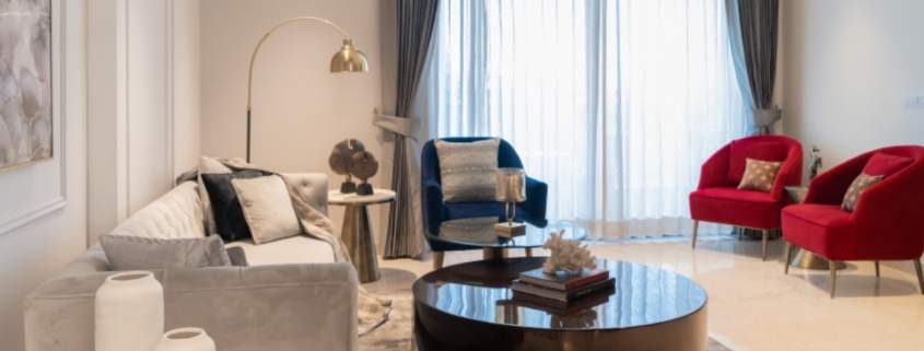
Finally, I and my team worked with the couple to select a colour scheme that would evoke a sense of opulence, without being overwhelming. Together we settled on a palette of rich jewel tones, including emerald green and sapphire blue, which were used in accents such as throw pillows and curtains.

Despite the limited budget, the end result was a stunning and luxurious space that exceeded the couple’s expectations. Amit and Neha were overjoyed with the transformation and felt that we at CreativesByRimaa had truly understood their vision and brought it to life in a way that was both beautiful and affordable.

Through this case study, we can see how we can use creativity, resourcefulness, and attention to detail to create opulent spaces that are accessible to a wide range of clients. By focusing on key elements such as lighting, texture, and colour, it is possible to transform even the most modest of spaces into something truly extraordinary.

Custom Furniture: Why Is It Worth the Splurge For Your Luxury Home?

Planning a luxury home and your interior designer suggested bespoke furniture? Unsure about the expenses? Let this blog help you decide! Bespoke furniture can be a significant investment for your home interior, but it also offers several benefits that make it worth the expense. Here are a few factors to consider if it is worth the splurge:

Tailored Design: Bespoke furniture is made to your exact specifications, allowing you to create pieces that are perfectly suited to your style and the interior of your home. This level of customization is not possible with mass-produced furniture.

High-Quality Materials: With bespoke furniture, you have the option to choose premium materials that will last for years and look beautiful. For example, you can choose hardwoods, fine fabrics, and custom hardware that reflect your personal taste.

Optimal Functionality: When you work with a bespoke furniture maker, you can add features that make your furniture more functional for your specific needs. For example, you can have a bed with built-in storage or a desk with extra shelves.

Increased Resale Value: Bespoke furniture can increase the resale value of your home because it is unique and of high quality. Potential buyers will appreciate the attention to detail and the fact that the furniture was made specifically for the space.

Investment: Bespoke furniture is an investment in your home and your personal style. It is made to last, so you can enjoy it for years to come.

It is important to consider your budget when planning an interior for your home and investing in bespoke furniture. While it can be more expensive than mass-produced furniture, the benefits it offers make it a valuable investment. As interior designers, we find a balance between style, functionality and budget to create a beautiful and functional home.

In conclusion, bespoke furniture is a worthwhile investment for your luxury home because of its tailored design, high-quality materials, optimal functionality, increased resale value, and investment in your personal style. At Creatives By Rimaa, we help you in getting these pieces designed and created to match the interior style and also keep in mind that they reflect your taste and elevate the look of your home. Explore our Instagram to see more of our work and work style.

The Techniques Of Doing Commercial Interior

While commercial interior design focuses more on making the space breathe professionalism and functionality, residential clients are more focused on making their abodes cosy and welcoming. These distinct differences bring forth the need to approach the project in an entirely different manner.

To start with let’s understand what we term commercial spaces. Commercial space design pertains to the interior design of spaces such as retail spaces, offices, lobbies, restaurants, malls, business Centres and other places for public use.

Let’s see how we use the seven elements of interiors differently for a commercial space. Before that let’s understand why are the 7 Elements of interior design important.

The 7 elements of design are designed to help you balance an interior scheme so that the finished look is aesthetically pleasing, as well as functional.

Let’s look at the 7 Basic Elements of Interior Design
Colour.
Form.
Light.
Line.
Pattern.
Texture.
Space.

4 BHK Duplex Luxury Home In Gurugaon: Interior Case Study

Design is like breathing, completely organic and not forced. The design comes naturally to me and making it look simpler and effortless is what I strive for.

Today we will be talking about “The Ivory Project:

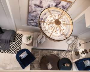
Client brief: The client wanted a luxury, modern and clutter-free home. Additionally, they wanted to use jewel tones in their living-dining space. It’s a 4500 sqft, duplex house in a condominium.

Challenges: Keeping harmony for the entire space, making the space inviting and clutter-free.

What we did

We have used jewel tones in combination with neutral tones. This makes the space look rich yet sustainable and timeless. We made it a cohesive theme.

We opted for panelling that has luxurious look and it is sustainable. The textures make the space luxurious and timeless. We created false roofing to give an absolute clutter-free look to the ceiling and used recessed lights which add sophistication to the entire space. We also created storage for nick-nacks under the stairs and gave it elegant look.
Living and dining space :

We have made it a continuous free space, separating the 2 spaces with a fluted glass partition with brass framing. This creates a feeling of privacy and openness thus making the space more cosy and inviting. The material palette, and the choice of jewel-tone fabrics, continue uninterruptedly between the spaces.

The rooms with all muted tones, few greens around the house, and perfect lighting uplift the overall space.

Most importantly the styling of the house, be it art, accessories or handpicked pieces, actually defines the overall space.

We have reused most of the doors provided by the builder and retained the bath fittings, thus balancing budgets and the design.

There are many things involved while creating a design, like textures, materials, lighting and styling. At the end of the day how you can make it look simpler and effortless, that is what designing is.

At the end of the day, a happy client is what matters. We delivered what the client wanted and gained another happy client. At the end of the day, when you see a smile on the client’s face, you feel that the whole hard work, and sweat, we have put into this has finally paid off.


Rattan decor has made a stylish comeback

With textures and intrigue taking the spotlight rattan furniture has swiftly made it one of the top spots in the interior design industry, especially in the luxury segment. It is no more limited to the garden and outdoor furniture options. In fact, it’s one of the hottest living room and bedroom components.

It excites me how creatively furniture designers are creating some beautiful pieces. I too have got some made for my clients recently and they look absolutely wow. I have been talking about trends and work I have done in this domain lately on my social handle however today I am taking the route of this blog to give you some insights into how you can use them for your interior.

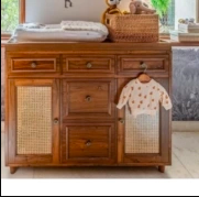
Before we move to that I would like to mention Anusha Nanavati and her team who beautifully designed a nursery for Sonam Kapoor’s son. She is really done a great job with rattan in this space and it looks very classy.
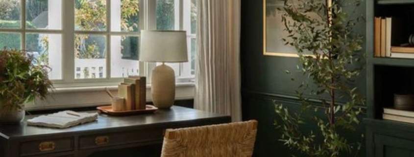
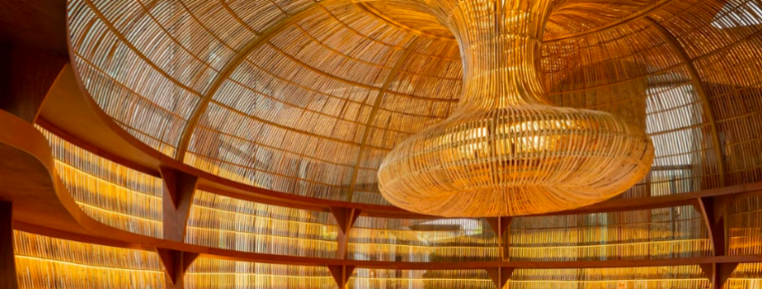
While reading and researching more about it I came across A project by Enter Project Asia at Chiang Mai Art Gallery in Chiang Mai, Thailand. The complex comprises several interior pavilions surrounded by gardens with sculptures and water features. They have created a fabulous installation using Rattan and it’s mesmerising( the cover pic is one of these installations). It’s really interesting to see how versatile Rattan is and the way its usage is evolving. We all want to use it in our space that too in an interesting way, so let’s look at some options here:

  1. Use Rattan as pendant lights: If you want to start using with just one element then lampshade or pendant lights would be a great idea.
  2. To Add texture: Use it in the living room or bedroom furniture or even decor to add rustic texture.
  3. Explore colours: No it’s not limited to ‘the traditional rattan colour’ you can mix and match it with the decor and use it in a wide range of colours.
  4. Include with your existing furniture: Add variation to your existing set of furniture by adding a few elements.

Hope you like these ideas. Remember don’t overdo the experiment keep it subtle and minimalist.

For more details and interior consultation for your home or office feel free to contact us.

Tips To Make Your Office Cozy Yet Luxurious

Work is where the heart is and let’s accept the fact that we spend most of our time in the office, so it’s more important that the workspace connects with the heart. Studies have claimed that a well-designed office is directly connected to the performance of the people working in the office. One of the reasons people feel Monday blue is because they have to leave the cosiness of their homes to reach the office. So isn’t it the best solution to make the office as comfortable and cosy as a home?

Well, many people may not agree as they want the offices to also have a grand luxurious feel. That’s when we at Creatives By Rimaa come into the picture. With our design and styling techniques, we can create a blend of both. Today I am sharing some interesting tips with you that will help you achieve this without much hassle.

Here are tips that will help you design your office space in a better way:
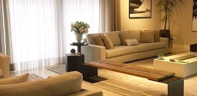
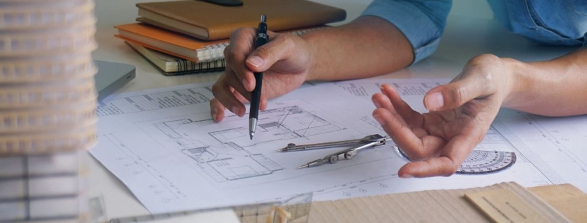
1. Use the space wisely: The most important factor is using the space wisely. The layout of the office space should not just look good, but also have efficiency and practicality.

2. Comfortable furniture: Get stylish and grand-looking furniture but don’t compromise on the comfort part.

3. Allow natural light: Natural light not just adds freshness but also makes the environment lively. It helps boost the mood, increase energy levels and create an overall positive work environment.

4. Find a smell that makes your heart happy with aromatherapy: Your room freshener should be pleasant and soothing. It will make the environment welcoming.

5. Use an accent rug that softens the room: adding an accent rug to your office will immediately warm up the space and gives it an overall homey feel. Prefer neutral and warm tones.

6. Decorate with inspiring art: Adding some peaceful and relaxing art can enhance the overall vibe of your space.

7. Live greenery or potted plants. They make the space fresh and add warmth. You can choose plants that thrive without natural light

8. Adjust the lighting in your space: Apart from natural lights, other lighting systems should also be considered carefully. Accent lamps feel more relaxing than a harsh overhead light, however, if there is no room for accent or floor lamps go for warmer lights.

9. Add music to the environment. Soothing and calming music will create a vibe. Note keep the volume soul pleasing.

10. Allow personalisation: Allow your team to personalise their workstation with their favourite quote, photo or plants.

Hope you find these tips useful. You can add your points in the comments and if you are still struggling with your office space look feel free to contact us.

6 Tips For Decorating Open Concept House

Open-concept living rooms are getting popular, especially in apartments. Also, as the children are moving out for studies and work the concept of open houses is more in demand. It looks nice and is very approachable. However if not designed and decorated well it might just appear as a complete mess instead of welcoming. It becomes challenging to make the rooms flow together. But that’s what experts are for, in this blog I have tried to make your life easier by helping you with some really simple ideas to bring everything together.

1. Use Area Rugs to Define Spaces: Where there is no natural division between the spaces area rugs are the best option to create them. For example, having an area rug for dining and another for the living room will give clear distinction to the spaces.
2. Use a Monochromatic Color Scheme: Using monochromatic shades is the safest bet when selecting colours as it prevents you from the challenge of creating sync between the colours.
3. Let the Architecture Be Your Guide: Usually open spaces have mouldings and panelling that create breaks between spaces. Use them smartly to organise the space.
4. Add Architectural Details: In case there is no moulding or panelling create some. For example, if you add wainscoting in the dining space it will make it separate from the living
5. Make Your Furniture Work For You: Use furniture to break up spaces, like placing chairs our couches between the two spaces.
6. Paint All the Trim the Same Color: To help create continuity paint all the trim the same colour. Even if you paint the walls different colours, using the same colour for doors, ceilings, window trim, and moulding will help make the spaces feel more cohesive and connected.

Share your thoughts in the comments. If there is something you would like to add to these points. For designing your homes you can connect with us on the numbers on our website or just fill out the form, we will be happy to help.

How I Think Differently Each time

There is nothing more personal than designing a home for someone else. However, that doesn’t mean interior designer imposes their personal likes and dislikes. Thinking differently is an important skill of a good interior designer. And that’s extremely important as no one wants the same-looking house and that’s so boring.

An interior designer should not impose his or her choices on the client. The approach should be your home your way.

When a designer is exposed to myriad design challenges they come up with excellent solutions. Questioning is an essential trait. Without enough questioning, you are unable to know your client and thus will end up under-delivering.

Seeing through obstacles is a very important skill that defines a good interior designer and helps in thinking differently. It’s about being imaginative about new thoughts and keeping the obstacles away.

These are skills that come naturally or build over a period of time. I am glad I have them naturally and it’s getting better each day.

7 tips on designing a rented home without making permanent changes

A home is a home, whether it is owned or rented, the dream is of living in a home that matches our personality. With property prices continuing to skyrocket, more of us are finding ourselves renting homes for the long-term, spending decades and even raising families in these houses. Here are some simple ways that you can use to get your home designed without making any civil alterations or permanent changes.

1. Give the space new colour: If you think that the space is in need of a fresh coat of paint, do that. The Colour of the space is the first thing that you would be able to connect with.

2. Use removable wallpaper: If painting is not an option, you can certainly use wallpapers to make the house yours.

3. Wall decor: Add some wall decor that matches your taste. You can also make a personalised photo wall. you can also use washi tapes to transform the walls

4. Artificial grass: Add artificial grass patches to your balconies and other open areas to give natural look to the space.

5. Add plants: Apart from artificial grass, bring home plants that you like and give a fresh and lively atmosphere to the space.

6. Update lightings: If possible change the chandeliers and lightings to match your taste. You can also add some floor lamps to match your taste.

7. Curtain magic: Two things that people notice first are walls and then curtains. Give the space brightness with curtains that match your interior theme and taste.

With these minor changes, you can personalise a rented home. At Creatives by Rimaa we design rented homes without making civil changes. You can always contact us to know details and visit us on Instagram to see our work and updates from us.