Why Following Interior Design Trends Is a Mistake

In the fast-paced world of interior design, new trends emerge every year, capturing our attention and promising to transform our homes into something fresh and exciting. Brimming with stunning visuals, social media platforms tempt us to follow these trends. But is chasing the latest design fads the best approach for creating a space that’s uniquely yours? As the Principal Interior Architect at CreativesByRimaa, I believe it’s worth reconsidering the urge to follow trends blindly.

The Pitfalls of Trend-Driven Design:

•⁠ ⁠Short Shelf Life: Trends are, by nature, fleeting. What’s considered chic and stylish today might look dated in just a few months. Investing in a trend can lead to a space that quickly feels out of touch.
•⁠ ⁠⁠Costly Updates: Constantly keeping up with design trends can be expensive. From furniture to décor, refreshing your space with each new trend can drain your finances over time.
•⁠ ⁠⁠Loss of Personalization: Following trends often means sacrificing personal style. Your home should reflect your personality, not just the latest Instagram craze. A trend-driven space can feel generic and disconnected from who you are.
•⁠ ⁠⁠Practicality vs. Aesthetics: Not all trends are practical. What looks great in a magazine might not suit your lifestyle or environment. For example, minimalist designs can be stunning but may lack the warmth and comfort needed in a family home.

Celebrate Timeless Design:

Rather than following trends, focus on timeless design principles that reflect your individuality and stand the test of time. Choose elements that resonate with your personal style and create a space that feels authentic and comfortable.

Your home is your sanctuary—a place where you should feel truly at ease. By prioritizing timeless design over fleeting trends, you can create a space that’s uniquely yours, filled with elements that you’ll love for years to come. Instead of chasing the latest fads, invest in a home that tells your story and brings you joy every day.

Wall Panels: Beyond the Hype, A Long-Lasting Solution for Homes

For decades, paint has reigned supreme as the go-to for interior walls. But a new contender is rising in interiors: wall panels. These beauties are more than just a fad; they offer a stylish and sustainable upgrade that injects personality and functionality into your living space.

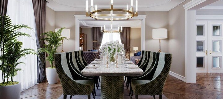
While paint can leave you feeling limited, wall panels open a world of design possibilities. From sleek and modern to warm and rustic, a panel style complements any aesthetic. Imagine textured finishes that add depth, or intricate patterns that create a dramatic focal point. Wall panels can even mimic the look of natural materials like wood or stone, bringing a touch of luxury without the hefty price tag.
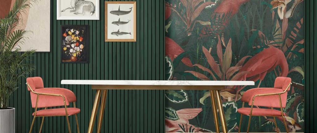
But the benefits extend far beyond aesthetics. Let’s understand them better:

* Long-Term Cost Effectiveness: The initial cost might be slightly higher than paint, but wall panels are incredibly durable. They resist scratches, scuffs, and everyday wear and tear, saving you money on frequent repainting.
* ⁠Trendy and Luxurious Look: Gone are the days of boring flat walls. Wall panels come in a wide variety of styles, from sleek and modern to warm and rustic. They can even mimic the look of natural materials like wood or stone, adding a touch of luxury to your space without breaking the bank.
* ⁠Solution to Seepage: Struggling with pesky moisture problems? Wall panels offer a practical solution! Many varieties are moisture-resistant, creating a barrier against seepage and protecting your walls from damage.
* ⁠Wide Variety: Gone are the limitations of paint colours. Wall panels offer a vast selection of styles, textures, and finishes to suit any design taste. From bold patterns to calming textures, you can create a truly unique and personalized space.
* ⁠Easy Installation and Maintenance: Unlike paint, which can be messy and time-consuming, wall panels are a breeze to install and maintain. Many types feature a click-lock system for easy installation, and all they need is a simple wipe-down to keep them looking fresh for years to come.


So, if you’re craving a décor upgrade that’s both stylish and sustainable, wall panels are a compelling option. With their versatility, durability, and ease of maintenance, they offer a long-lasting solution that will transform your space and leave you wondering why you didn’t embrace them sooner.

Beyond Trends: Creating Timeless Luxury Interiors

We all flip through a magazine and get struck by a gorgeous living space, only to realize a few years later it feels dated. Trends come and go, but true luxury lies in creating a home that reflects your essence and endures the test of time. Here at Creatives By Rimaa, we believe in crafting timeless luxury interiors – spaces that are as unique and individual as you are.

So, how do we achieve this? Let’s delve into a few key concepts:
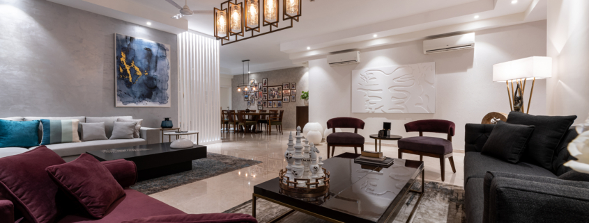
1. Understanding Your Legacy: Luxury isn’t just about expensive materials. It’s about creating a space that tells your story. We begin by getting to know you. What are your passions? What kind of atmosphere uplifts you? Do you have cherished heirlooms you want to incorporate? By understanding your legacy, we weave these elements into the design, creating a space that feels authentically you.

2. Investing in Quality Craftsmanship: Fast furniture may be trendy, but it rarely stands the test of time. We focus on incorporating well-made pieces crafted from superior materials. This doesn’t mean everything has to be antique – a beautifully designed modern sofa upholstered in luxurious velvet can become a cherished heirloom.

3. ⁠Classic Design Principles: Timeless design relies on established principles like balance, proportion, and scale. These principles create a sense of order and harmony that’s inherently calming and never goes out of style. We’ll use these principles as a foundation, ensuring your space feels effortlessly elegant.

4. ⁠A Curated Palette: Faddish color trends can be fleeting. Instead, we develop a color palette that reflects your personality and complements your architectural style. This might involve timeless neutrals like warm creams or rich grays accented with pops of color that reflect your favorite artwork or a cherished travel destination.

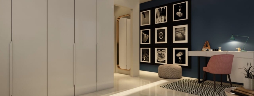
5. The Power of Personal Touches: While luxury has a certain grandeur, it shouldn’t feel impersonal. We encourage you to incorporate personal touches that reflect your passions and heritage. Perhaps it’s a collection of travel photographs displayed in a unique gallery wall, or a vintage rug passed down through generations. These elements add layers of character and meaning, making your space truly one-of-a-kind.

Ultimately, a timeless luxury interior is a space that transcends trends and reflects the soul of its owner. It’s a space that feels like a sanctuary, a place where you can unwind, entertain, and create lasting memories.

Are you ready to craft a timeless space that reflects your legacy? Contact us today for a consultation

5 Sneaky Interior Design Mistakes and How to Fix Them!

Creating a beautiful and inviting home is all about thoughtful planning and execution. While avoiding common mistakes like mismatched furniture scale or forgetting lighting is crucial, there are some lesser-known design pitfalls that can catch you off guard. Let’s explore five sneaky mistakes that might be lurking in your dream space, along with solutions to steer you clear:

Mistake #1. Forgetting the Fifth Wall: The Ceiling

We often focus on adorning walls with artwork and mirrors, but the ceiling is prime real estate for adding personality and dimension.

The Fix: Consider a painted accent ceiling in a soft complementary color, exposed beams for a rustic touch, or even patterned wallpaper for a dramatic statement. If your ceiling is high, add architectural details like moldings or medallions to create visual interest.

Mistake #2: Ignoring Traffic Flow

Imagine navigating a maze in your own home! Thoughtless furniture placement can create bottlenecks and disrupt the natural flow of movement within a room.

The Fix: Draw a rough floor plan of your space and arrange furniture on paper before moving anything heavy. Ensure a clear pathway exists for accessing doorways, windows, and other functional areas.

Mistake #3: Underestimating the Power of Textiles

Rugs, curtains, and throw pillows are the unsung heroes of interior design. The wrong textures or patterns can throw off the entire aesthetic.

The Fix: Select textiles that complement your chosen color scheme and style. Mix textures for visual intrigue, but keep patterns balanced. For example, pair a patterned rug with solid-colored curtains.

Mistake #4: Lighting Like a Caveman
Imagine relying solely on a single flickering torch to illuminate your entire home. That’s the vibe you get with one harsh overhead light. Layered lighting is key to creating a comfortable and functional space.

The Fix: Incorporate a combination of ambient, task, and accent lighting. Ambient lighting provides general illumination (think overhead fixtures or recessed lighting). Task lighting focuses on specific areas for activities like reading (table lamps) or cooking (under-cabinet lights). Accent lighting highlights artwork, architectural features, or creates a mood (think floor lamps or sconces). Dimmer switches are your friend, allowing you to adjust the overall brightness for different occasions.

Mistake #5: Forgetting Form Follows Function

A beautiful space should also be practical. Awkward furniture layouts or neglecting storage solutions can lead to frustration and clutter.

The Fix: Choose furniture that’s the right scale for the room and consider its functionality. Ottomans can offer hidden storage, while coffee tables with shelves can keep magazines and books organized. Invest in stylish storage solutions like baskets, cabinets, or ottomans with built-in compartments. This way, you can maintain a clutter-free and aesthetically pleasing space.

Remember: A well-designed home should not only look good but also feel good to live in. By avoiding these sneaky mistakes and prioritizing both form and function, you can create a space that reflects your personality and brings you joy.

Your Place, Your Vibe: Interior Design Hacks to Make Your Home YOU

Ever walk into a room and instantly feel “at home”? It’s not just comfy furniture (although that helps!). It’s a space that reflects YOU – your quirks, your passions, your story. But how do you take your personality and turn it into walls and furniture? Here’s the lowdown:

1. Ditch the Catalog Look:

Your home shouldn’t look like it came out of a magazine. Think of it as a museum showcasing your life’s adventures! Hang travel souvenirs in a hallway, dedicate a corner to your instrument collection, or create a cozy nook for your favorite books.

2. Surprise Yourself (and Your Guests!):

Don’t be afraid to mix things up! Throw a modern couch next to a vintage lamp, or create a dramatic entrance with a giant statement piece. These unexpected touches spark conversation and show off your unique style.

3. Light Up What You Love:

Lighting sets the mood, so use it to tell your story. Bright task lights for reading, spotlights over your crafting station – light up the things you love to do. Dimmer switches let you change the vibe, transforming your space from a creative zone to a chill hangout.

4. Feel the Space, Not Just See It:

Think beyond just looks. Soft throws add comfort, while exposed brick creates an industrial feel. Play with sound – create a music corner, or use rugs to dampen noise in specific areas.

5. Embrace the Sunshine (and Yourself):

Natural light is amazing for your mood and for showcasing your personality. Let the sunshine in with big windows or skylights. This openness not only reflects your connection with the outdoors but also makes you feel fantastic.

Your home is waiting to be your masterpiece. Use these hacks to create a space that screams YOU.

Ready to unleash your home’s hidden personality? Schedule a consultation today and let’s make your space magic!

Let There Be Light: The Designer’s Guide to Lighting

As designers, we understand the transformative power of light. It sets the mood, defines zones, and showcases the beauty of our design decisions. Mastering architectural lighting is the key to turning a house into a home, a space that not only looks stunning but feels truly livable.

The Secret is in the Layers

Think of architectural lighting as a symphony – a harmonious blend of different elements, each playing a vital role. Here are the key players:

Ambient Lighting: This is the foundation, the warm glow that sets the overall mood. Recessed can lights are a popular choice, but for a touch of luxury, consider cove lighting, which hides the light source and bathes the space in a soft, diffused light. In a modern living room, for instance, sleek track lighting can create a gallery-like feel, highlighting artwork and adding a touch of drama.

Task Lighting: This is all about functionality. Imagine prepping a gourmet meal in a kitchen shrouded in dimness – not ideal! Here, under-cabinet lighting ensures countertops are well-lit, while pendant lights over the sink or island add a decorative touch and provide focused illumination for washing dishes. In a bedroom, bedside sconces with adjustable arms offer the perfect reading light, while a statement floor lamp in a cosy corner creates a perfect spot for curling up with a book.

Accent Lighting: This is where we get to play with drama! Strategic use of spotlights, track lighting, or strategically placed LED strips allows us to highlight architectural details, showcase treasured artwork, or create a focal point in a room. Imagine uplighting a stunning stone wall in a living room to create a warm, inviting atmosphere, or using recessed spotlights to accentuate the intricate details of a hand-woven rug in a dining room.

Room by Room Spotlight

Now, let’s see how these layers translate into different rooms:

Bedroom: Create a sanctuary of serenity with layered lighting. Dimmable recessed lights provide a warm glow, perfect for unwinding. Bedside sconces with warm white bulbs offer task lighting for reading, while cove lighting above the headboard adds a touch of luxury and creates a relaxing ambience.

Living Room: Encourage conversation and relaxation with a warm and inviting ambience. Recessed lighting provides general illumination, while strategically placed floor lamps with warm white bulbs create cosy corners for intimate gatherings. Don’t forget accent lighting! Use track lighting to showcase a statement piece of art or strategically placed spotlights to highlight architectural details like a beautiful brick fireplace.

Dining Room: Set the stage for memorable meals. A statement chandelier is a classic choice for beautiful ambient lighting. Dimmer switches allow you to adjust the mood, while pendant lights over the table with a slightly cooler colour temperature (around 4000 kelvin) ensure a well-lit dining experience.
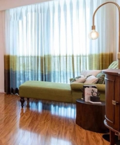
Kitchen: Functionality reigns supreme here. Recessed downlights with a cool colour temperature (around 4000 kelvin) provide overall brightness, while under-cabinet task lighting illuminates countertops for food prep. Pendant lights over the sink or island can add a decorative touch and provide additional task lighting.

Bathroom: Balance relaxation and task lighting. Recessed lights with a neutral colour temperature offer overall illumination, while sconces flanking the mirror with a slightly cooler colour temperature provide task lighting for grooming. Consider dimmer switches for a spa-like experience, allowing users to create the perfect ambience for a relaxing bath.

Beyond the Basics: Pro Tips for Lighting Design

* Color Temperature: Remember, warmer light (around 3000 kelvin) creates a cosy feel, while cooler temperatures (around 4000 kelvin) enhance task visibility. Play with colour temperature to create different moods in different areas.
* ⁠Dimming Controls: Dimmer switches are your best friend! They allow for ultimate flexibility, letting you transform a space from bright and functional to intimate and inviting.
* ⁠LED Technology: Embrace energy-efficient LED fixtures. They offer long lifespans, a variety of color temperatures, and are often dimmable.

Light the Way to Design Success

By understanding the power of architectural lighting and applying these tips strategically, you can elevate your residential projects to new heights. Remember, lighting is an integral part of your design scheme. It’s not just about illumination; it’s about creating an experience, a feeling. So go forth, light up your designs, and create spaces that are not only beautiful but truly livable.

Design with Feeling: A Multi-Sensory Guide to Your Dream Home

Our homes are more than just bricks and mortar; they’re sanctuaries for the soul. But have you ever considered the power of design to engage all five senses? Imagine a space that not only looks beautiful but also feels calming, invigorates your senses, and sparks joy.

Sight: A Feast for the Eyes

  • Colour Psychology: Colors have a profound impact on our mood and energy levels. Warm colours like reds and oranges evoke feelings of warmth and energy, while cool colours like blues and greens promote relaxation and tranquillity.
  • Light Play: Strategic lighting can transform a room. Layer ambient lighting with task lighting and accent lighting to create different moods and highlight design features.
  • Textural Tapestry: Incorporate a variety of textures to add visual interest and depth. Think plush rugs, smooth marble countertops, and woven throws.

Touch: A Sense of Comfort

  • Material Matters: Fabrics and finishes play a crucial role in creating a tactile experience. Plush velvet invites touch, while cool marble provides a refreshing contrast. Layer textures with throws, cushions, and natural materials like wool and linen.
  • Temperature Play: Consider the thermal properties of your materials. Wood floors feel warm underfoot, while strategically placed area rugs add a touch of comfort in high-traffic areas.

Smell: The Freshness Factor

  • Harness the Power of Natural Light: Sunlight is a natural disinfectant and helps eliminate lingering odours. Maximize natural light with well-placed windows and skylights. Opt for functional window treatments that allow for ample light control and ventilation.
  • Embrace Fresh Air: Encourage air circulation with proper ventilation strategies. Strategically placed windows and exhaust fans in kitchens and bathrooms help remove unwanted odours and promote a sense of freshness.
  • Interior Techniques for a Fresh Scent: Consider incorporating natural odour absorbers like strategically placed bowls of activated charcoal or baking soda. Scented candles and diffusers can add a pleasant touch, but use them sparingly to avoid overpowering fragrances. Opt for essential oils with refreshing properties like lemon or peppermint.

Taste: A Culinary Canvas

  • The Kitchen as a Haven: Design a kitchen that fosters a sense of warmth and invites you to create culinary masterpieces. Prioritize a functional layout with ample workspace and well-placed appliances.
  • The Joy of Dining: Create a dining space that inspires conversation and connection. Choose comfortable seating and a visually appealing table setting. Consider incorporating ambient lighting to create a warm and inviting atmosphere.

Sound: A Symphony of Comfort

  • Material Magic: Utilize sound-absorbing materials like textured wallpaper, thick curtains, and woven rugs to soften sounds and reduce echo.
  • Architectural Harmony: Consider open floor plans with designated quiet zones for activities that require focus.
  • The Gentle Whisper of Nature: Wind chimes strategically placed on balconies or patios can create a calming and natural soundscape.

By incorporating these multi-sensory design elements, you can transform your home into a haven that speaks to your soul. Remember, it’s all about creating a space that reflects your unique personality and awakens your senses. So, close your eyes, imagine your dream home, and design with feeling!

From Grandma’s Attic to Chic Abode: The Resurgence of Vintage Vibes

Remember the thrill of rummaging through your grandparents’ attic, unearthing forgotten treasures like a chipped porcelain doll or a dusty gramophone? Vintage interior design capitalizes on that very sentiment, weaving the charm of the past into the fabric of modern living.

Gone are the days of sterile, cookie-cutter spaces. Today’s design scene embraces the unique stories and character that vintage and antique pieces bring. A well-placed antique armoire adds a touch of old-world elegance, while a mismatched set of vintage chairs injects personality and a sense of lived-in comfort.

The beauty of this trend lies in its versatility. You can curate a space that whispers of a specific era, like the glamour of Art Deco or the rustic charm of farmhouse chic. Or, you can create an eclectic mix, blending elements from different periods for a truly unique and personal aesthetic.

This resurgence isn’t just about aesthetics; it’s a conscious move towards sustainability. Vintage pieces are often crafted with superior materials and built to last, a stark contrast to the fast-furniture culture of today. Owning a vintage treasure is not just about style; it’s about embracing the history and soul embedded within each piece.

So, the next time you’re tempted by the latest trends, consider venturing down the path of vintage. You might just discover a hidden gem that not only elevates your space but also tells a captivating story within your own home.

Beyond The Basics: Finding Balance with Minimalist-Maximalist Fusion

Minimalism and maximalism. Two design philosophies are seemingly at war. One craves clean lines and empty spaces, and the other revels in colour, pattern, and a curated explosion of personality. But what if you crave elements of both? Can you bridge the gap and create a space that’s both serene and stimulating?

The answer is a resounding yes! Enter the world of minimalist-maximalist fusion, a design trend that celebrates the best of both worlds. Here’s how to achieve this harmonious balance in your interior design:

Embrace the Power of Layout:

  • Minimalist Foundation: Start with a minimalist base. Think clean lines, open floor plans, and uncluttered furniture arrangements. This creates a sense of spaciousness and calm, the perfect canvas for your maximalist touches.
  • Maximalist Moments: Once you have the base, designate specific areas for maximalist expression. Maybe it’s a statement accent wall in the living room or a curated gallery display in the hallway. By creating dedicated zones for maximalist flourishes, you avoid visual overload.

Play with Proportion:

  • Minimalist Furniture: Opt for furniture with simple lines and neutral tones in the main living areas. This doesn’t mean boring! Choose pieces with interesting textures or subtle details to add visual interest without cluttering the space.
  • Maximalist Accents: Introduce maximalist elements through statement pieces. It could be a bold rug that grounds the living room, a sculptural lamp that adds a touch of whimsy, or a vintage sideboard overflowing with personality.

Colour with Care:

  • Minimalist Palette: As a base, choose a minimalist colour palette for walls and floors. Think whites, greys, or earthy tones. This creates a sense of cohesion and allows your maximalist accents to pop.
  • Maximalist Pops: Introduce pops of colour through your curated maximalist zones. Maybe it’s a vibrant artwork, a collection of colourful throw pillows, or a unique patterned rug. Just remember, keep the maximalist colour palette limited to avoid overwhelming the eye.

Think “Japandi”:

For design inspiration, look to the emerging trend of “Japandi.” This style beautifully blends Japanese minimalism with Scandinavian warmth. It achieves this balance through:

  • Natural Materials: Both Japanese and Scandinavian design emphasize natural materials like wood, stone, and woven textures. These elements add warmth and texture to a minimalist space.
  • Functional Beauty: Both styles prioritize functionality. Furniture should be well-crafted and serve a purpose, even as it adds a touch of minimalist elegance.

Remember, the key to a successful minimalist-maximalist fusion is balance. By carefully considering layout, proportion, colour, and drawing inspiration from styles like Japandi, you can create a home that reflects your unique personality while maintaining a sense of calm and order. So, don’t be afraid to experiment and find the perfect harmony between clean lines and curated chaos!

Small Space, Big Impact: Design Hacks to Maximize Your Mini-Mansion

Living in a compact space doesn’t have to mean feeling cramped. With a few clever design tricks, you can create the illusion of more square footage and transform your cosy quarters into an oasis of style and comfort. Here are some tips to help you maximize the impact of your miniature masterpiece:

Lighten Up & Let the Sunshine In:

1. Embrace Light Colors: Opt for light and airy colours like white, pale blues, or soft yellows for your walls and major décor elements. These light hues reflect light more readily, making your space feel open and airy.
2. Banish the Bulky Blinds: Heavy curtains or dark blinds can visually shrink your space. Opt for sheer curtains or Roman shades that allow natural light to flood the room. Natural light is not only good for your mood, but it also creates a sense of spaciousness.
3. Strategically Placed Mirrors: Mirrors act like magic windows, reflecting light and visually expanding the footprint of your space. Place a large mirror opposite a window to maximize the natural light or use strategically placed smaller mirrors to create depth and dimension.

Create the Illusion of Height:

1. Vertical Lines are Your Friend: Draw the eye upwards with vertical stripes on wallpaper or accent walls. Hang long, flowing curtains that reach to the floor to create a sense of increased ceiling height.
2. Mind the Scale of Artwork: Oversized artwork can overpower a small space. Choose smaller pieces of art or create a gallery wall with strategically spaced frames to add visual interest without overwhelming the walls.
3. Exposed Brick or Wainscoting (Half Wall): Expose existing brick walls or create a half-wall wainscot treatment. This technique adds visual texture and draws the eye upwards, making your space feel taller.

By incorporating these design tricks, you can create a visually expansive and inviting space, even within a compact footprint. Remember, small spaces can be big on style and functionality with a little creative planning and these design hacks!