From Grandma’s Attic to Chic Abode: The Resurgence of Vintage Vibes

Remember the thrill of rummaging through your grandparents’ attic, unearthing forgotten treasures like a chipped porcelain doll or a dusty gramophone? Vintage interior design capitalizes on that very sentiment, weaving the charm of the past into the fabric of modern living.

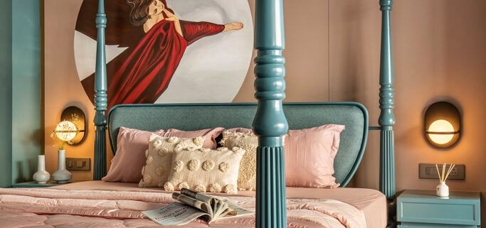
Gone are the days of sterile, cookie-cutter spaces. Today’s design scene embraces the unique stories and character that vintage and antique pieces bring. A well-placed antique armoire adds a touch of old-world elegance, while a mismatched set of vintage chairs injects personality and a sense of lived-in comfort.

The beauty of this trend lies in its versatility. You can curate a space that whispers of a specific era, like the glamour of Art Deco or the rustic charm of farmhouse chic. Or, you can create an eclectic mix, blending elements from different periods for a truly unique and personal aesthetic.

This resurgence isn’t just about aesthetics; it’s a conscious move towards sustainability. Vintage pieces are often crafted with superior materials and built to last, a stark contrast to the fast-furniture culture of today. Owning a vintage treasure is not just about style; it’s about embracing the history and soul embedded within each piece.

So, the next time you’re tempted by the latest trends, consider venturing down the path of vintage. You might just discover a hidden gem that not only elevates your space but also tells a captivating story within your own home.

Beyond The Basics: Finding Balance with Minimalist-Maximalist Fusion

Minimalism and maximalism. Two design philosophies are seemingly at war. One craves clean lines and empty spaces, and the other revels in colour, pattern, and a curated explosion of personality. But what if you crave elements of both? Can you bridge the gap and create a space that’s both serene and stimulating?

The answer is a resounding yes! Enter the world of minimalist-maximalist fusion, a design trend that celebrates the best of both worlds. Here’s how to achieve this harmonious balance in your interior design:

Embrace the Power of Layout:

  • Minimalist Foundation: Start with a minimalist base. Think clean lines, open floor plans, and uncluttered furniture arrangements. This creates a sense of spaciousness and calm, the perfect canvas for your maximalist touches.
  • Maximalist Moments: Once you have the base, designate specific areas for maximalist expression. Maybe it’s a statement accent wall in the living room or a curated gallery display in the hallway. By creating dedicated zones for maximalist flourishes, you avoid visual overload.

Play with Proportion:

  • Minimalist Furniture: Opt for furniture with simple lines and neutral tones in the main living areas. This doesn’t mean boring! Choose pieces with interesting textures or subtle details to add visual interest without cluttering the space.
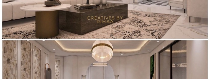
  • Maximalist Accents: Introduce maximalist elements through statement pieces. It could be a bold rug that grounds the living room, a sculptural lamp that adds a touch of whimsy, or a vintage sideboard overflowing with personality.

Colour with Care:

  • Minimalist Palette: As a base, choose a minimalist colour palette for walls and floors. Think whites, greys, or earthy tones. This creates a sense of cohesion and allows your maximalist accents to pop.
  • Maximalist Pops: Introduce pops of colour through your curated maximalist zones. Maybe it’s a vibrant artwork, a collection of colourful throw pillows, or a unique patterned rug. Just remember, keep the maximalist colour palette limited to avoid overwhelming the eye.

Think “Japandi”:

For design inspiration, look to the emerging trend of “Japandi.” This style beautifully blends Japanese minimalism with Scandinavian warmth. It achieves this balance through:

  • Natural Materials: Both Japanese and Scandinavian design emphasize natural materials like wood, stone, and woven textures. These elements add warmth and texture to a minimalist space.
  • Functional Beauty: Both styles prioritize functionality. Furniture should be well-crafted and serve a purpose, even as it adds a touch of minimalist elegance.

Remember, the key to a successful minimalist-maximalist fusion is balance. By carefully considering layout, proportion, colour, and drawing inspiration from styles like Japandi, you can create a home that reflects your unique personality while maintaining a sense of calm and order. So, don’t be afraid to experiment and find the perfect harmony between clean lines and curated chaos!

Small Space, Big Impact: Design Hacks to Maximize Your Mini-Mansion

Living in a compact space doesn’t have to mean feeling cramped. With a few clever design tricks, you can create the illusion of more square footage and transform your cosy quarters into an oasis of style and comfort. Here are some tips to help you maximize the impact of your miniature masterpiece:

Lighten Up & Let the Sunshine In:

1. Embrace Light Colors: Opt for light and airy colours like white, pale blues, or soft yellows for your walls and major décor elements. These light hues reflect light more readily, making your space feel open and airy.
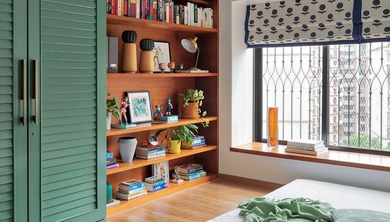
2. Banish the Bulky Blinds: Heavy curtains or dark blinds can visually shrink your space. Opt for sheer curtains or Roman shades that allow natural light to flood the room. Natural light is not only good for your mood, but it also creates a sense of spaciousness.
3. Strategically Placed Mirrors: Mirrors act like magic windows, reflecting light and visually expanding the footprint of your space. Place a large mirror opposite a window to maximize the natural light or use strategically placed smaller mirrors to create depth and dimension.

Create the Illusion of Height:

1. Vertical Lines are Your Friend: Draw the eye upwards with vertical stripes on wallpaper or accent walls. Hang long, flowing curtains that reach to the floor to create a sense of increased ceiling height.
2. Mind the Scale of Artwork: Oversized artwork can overpower a small space. Choose smaller pieces of art or create a gallery wall with strategically spaced frames to add visual interest without overwhelming the walls.
3. Exposed Brick or Wainscoting (Half Wall): Expose existing brick walls or create a half-wall wainscot treatment. This technique adds visual texture and draws the eye upwards, making your space feel taller.

By incorporating these design tricks, you can create a visually expansive and inviting space, even within a compact footprint. Remember, small spaces can be big on style and functionality with a little creative planning and these design hacks!

The Art of Architectural Light: Integrating Lighting into Your Design

Light is more than just illumination; it’s a fundamental design element with the power to shape the atmosphere and functionality of a space. Architectural lighting takes this concept a step further, using strategically placed fixtures to integrate seamlessly with your design and elevate the architecture itself.

In this post, we’ll delve into the world of architectural lighting, exploring the different techniques that can transform your space:

Common Applications of Architectural Lighting:

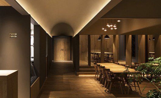
Cove Lighting: Imagine a soft, diffused glow emanating from your walls or ceilings. Cove lighting achieves this by hiding light sources behind a ledge or soffit, bathing the space in a warm and inviting ambience. This technique is perfect for highlighting architectural details, creating a sense of spaciousness, or adding a touch of luxury to living rooms, hallways, and even hospitality settings.

Uplighting: Want to make your walls come alive? Uplighting strategically places light sources at the base of walls, washing them upwards and creating a dramatic effect. This technique emphasizes the verticality of a space, showcases textured surfaces like brick or stone, and adds a touch of drama to entryways, foyers, or even outdoor facades.

Linear Recessed Lighting: For a sleek, modern look, linear recessed lighting offers a clean and unobtrusive way to illuminate a space. Long, narrow fixtures are recessed into the ceiling, providing even washes of light that are perfect for hallways, kitchens, workspaces, and any area that demands a clean and functional aesthetic.

Surface Mounted Lighting: Surface-mounted fixtures offer a more versatile option. These lights are directly mounted on the ceiling or wall, providing a wider range of design possibilities. From sleek square panels to decorative sconces, surface mounted lighting can add both function and personality to living rooms, bedrooms, and even retail spaces.

Suspension Lighting: A well-placed pendant lamp or chandelier can become a stunning focal point in a room. Suspension lighting hangs from the ceiling, providing both task lighting and a decorative element. Pendants are perfect for kitchen islands, dining tables, or even reading nooks, while chandeliers add a touch of grandeur to entryways and living areas.

Remember: The key to successful architectural lighting lies in layering these techniques. By combining different types of lighting, you can create a space that is both functional and visually engaging. Consider the mood you want to set, the activities that will take place in the space, and the architectural features you want to highlight.

With a touch of creativity and these handy lighting techniques, you can transform your space from ordinary to extraordinary!